(click on pics for full size)
All three of these are tiling, please check the tile background box in the design panel. To see what two of the three look like live, visit @aouaLOST and @SideStepsTEST.


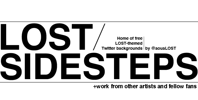
A few months ago when LOST ended, I was all, "This is the last Twitter background I will ever give you here"...Yeah. I lied.
But not without good reason, friends! There's a new version of Twitter out, and because of the much wider user interface, you can't see much of your background unless you're on a wide screen (Meanwhile, new Twitter is stunning on Mac's cinema displays and the old backgrounds look just fine). On your typical laptop, old Twitter had about 250 pixels to the left and right of the page content. The new version shrinks that down to about 112 pixels on each side (The sidebar is now semi-transparent, though a little more transparency wouldn't hurt, in my opinion). For that small a space, I've found that tall, tiling backgrounds work best. So here you have it. Last ones, for real this time.