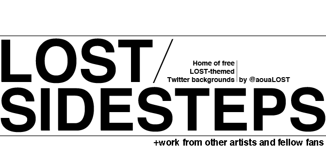

So here's the deal. I'm a graphic design student. Literally just learned the basics of Photoshop last year. This week I've been working on a project for school, and today my instructor basically tells me I'm in a design rut. Go crazy, kid! Break away from your left-aligned Helvetica phase. Uh-huh. Too bad I'm totally in love with it. Another thing I'm in love with? LOST.
So I was bored tonight, and instead of working on said school project like I should have been, I made these mock ads for my other tiny site, All of Us Are LOST, what I like to call a super-quick recap website, born of a web development class. Ah, school...
The first ad is done in my usual style. The second, still pretty similar, but slightly retro, and with a novelty font. As always, click the pictures for a full-resolution copy.
And before you run off, assuming you haven't already stopped reading, I'll be posting a new set of Twitter backgrounds in a few hours. They've already been made, but I found that when I post them at a reasonable hour, instead of at 3 in the morn like this post, people actually check them out. Until then, good day to you. :)
EDIT: Oh, looky here. The Twitter post is right below this one.


0 comments:
Post a Comment